
Graphic & Digital Work
Night-Glo is a movie that my friend wrote and directed while in high school. He asked me to create the cover art for the movie, which I had never done before. I laid it out in Photoshop over the course of a couple months, opting for a stacked character design as an attempt to make the student film feel more legitimate.
I also was able to design a Youtube thumbnail and use it as the DVD label art.
Dial One First was a short thriller film made during the pandemic. I designed the Youtube thumbnail to invoke a movie like Face/Off. I thought this would especially work because the two actors in the thumbnail are cousins, and have similar facial features. I also created a simple Photoshopped image of a phone to be used for marketing on social media.
Bad Faith
Bad Faith is a short student film still in production for which I was asked to make the Youtube thumbnail, DVD cover, and posters. I staged photos of a madonna statue in a party setting, hoping to contrast the rigidity of religion with the chaos of a drunken night of sin.
I then designed an alternate option in Illustrator: a simple grayscale image of a madonna that evoked more modern printmaking methods like stencil. This was paired with a similar design for a DVD label.
Finally I turned to movie posters, trying out different ideas in Photoshop and drawn digitally in Procreate. For this project, I challenged myself to make the art look more professional, and less DIY-looking than my previous film visuals.
Visuals and Packaging for Film
Kill Devil Hills
Kill Devil Hills is an alternative rock band currently located in Boston, MA.
Having been sent their logo / font, I decided to try and form some logos and symbols for the band for fun. I first created a simple, hill-shaped image derived from their original font, which I thought combined their name with a volume bar display.
Additionally, I designed a geometrically based logo of the letters KDH, which seem simple but eye-catching, especially when out of context and rotated 90°. I wanted to create something simple but memorable, which is why I stuck to 2D graphics and a black and white color palette.
∞∞∞
Later, the band reached out to me again to ask if I could make some designs for merchandise (t-shirts, stickers, etc.). During this process, I was inspired by sketches, diagrams, and blueprints, especially charts that showed a human’s field of vision (which is the name of a Kill Devil Hills song). Eventually, I landed on a design that didn’t necessarily have a direct connection to the band, but instead provided ominous imagery when placed next to the Kill Devil Hills name.
Music Merchandise and Posters
Fencing is an indie rock band from Lewiston, ME. After helping them direct a music video in 2021, I took some stills from the video and edited them using Photoshop to create promotional posters for the band.
I then decided to create small symbols for the band, with each symbol representing a different song. This idea stemmed from the drummer saying he had trouble remembering exactly which beat belonged to which song. I figured a visual representation of the songs would be beneficial to him, and fun for me to make.
∞∞∞
Final Design

Paperbark Magazine
Paperbark Literary Magazine was brought back to life in the Fall of 2021 by a group of motivated graduate students at UMass Amherst. Looking to have more control over the design than in previous issues, the editorial board decided to hire a small team of three undergraduate design students to jumpstart their vision: Paolo Brandon, Mikaela Bowler, and me.
With a very small time frame of about 2 months, our team launched an entirely new look for the magazine; fresh fonts, bright popping colors, compelling ecologically based logos, and the decision to print in a smaller size. We finally completed the 100-page layout by December of that year, just 10 weeks after our first team meeting.
Below are samples of the spreads that I worked on:
My goal at the Daily Collegian was to revitalize the graphics section that had been previously abandoned. I joined in 2020 alongside a couple other graphic students, but it wasn’t until I became the Graphics Editor in the Fall of 2021 that I started to flourish creatively. Most of my graphics for the Collegian were made on a fast-paced schedule with sometimes less than a day’s notice. But with the help of an understanding and collaborative board of editors, the Graphics section became an often utilized tool for visally elevating articles.
That Bar
A friend reached out to me asking to design a street sign for That Bar, a bar in Brooklyn, NY. After some early ideas and a few alterations in Adobe Illustrator, the bar was happy with my line-based logo with an elegant font. I sent it to my friend and he painted it onto the storefront.
The Cost of Attention
Connection Overload is my attempt at illustrating being trapped in a shallow state of consciousness as we interact with meaningless content. As we grasp from one topic to another, it feels mind-numbing and unproductive. Combining aggregated content from my social media feed, I built an image that was visually stimulating, yet devoid of meaning.
At the end of my senior year of college, I created a series of works that acted as a critique of widespread issues in the modern social media age. In my research for the project, I identified five topics that I wanted to turn into artistic representations; I titled them Endless Scrolling, Flattened Friendship, Positivity Bias, Connection Overload, and Instant Gratification.
Flattened Friendship is an abstract representation of the ubiquitous ‘friend’ on social media. Because online ‘friends’ can range from family to stranger, I wanted to illustrate this person who watches us persistently and emotionlessly.
These portraits were created in Photoshop by blending together the faces of people I know in real life until they are almost unrecognizable, but maintaining an eerie sense of familiarity.
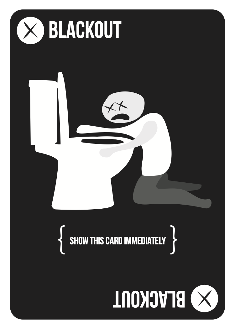
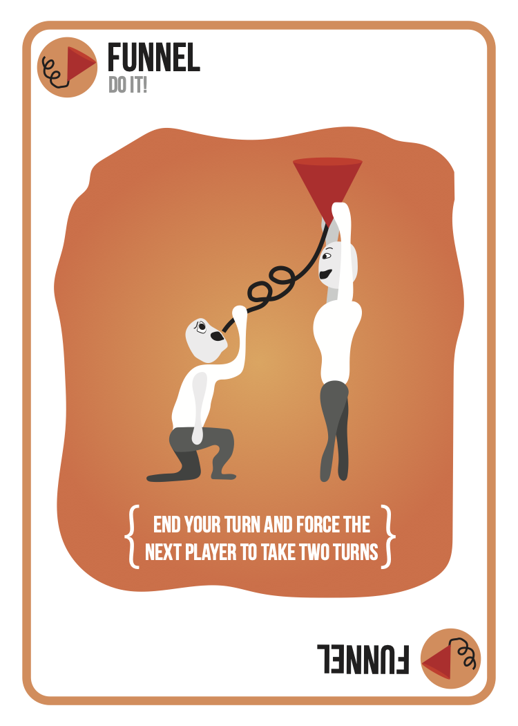
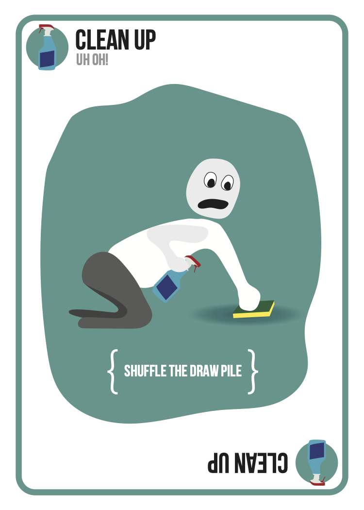
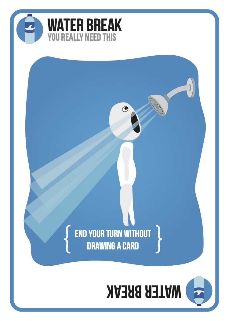
Blackout Card Game
Final Products
Original Sketches
Created as a project in college, Blackout originated as a drinking game concept tied to the Happy Hour Fund, a mutual aid based in Washington DC and LA. With a short turnaround time, I decided to rework an already existing game, Exploding Kittens. By maintaining the game mechanics and basic graphic elements while completely overhauling the art and design, I created a more mature drinking game that preserved the goofiness of the original.
The graphics were all drawn and created in Illustrator. The cards were printed through myplayingcards.com.


Dream Journal
As a project for a graphic design course, I was tasked with creating a wireframe for an app in Adobe XD. I chose to build Dream Journal, an app that allowed people to log, organize, and share their dreams. These are screenshots of both the desktop and mobile versions.
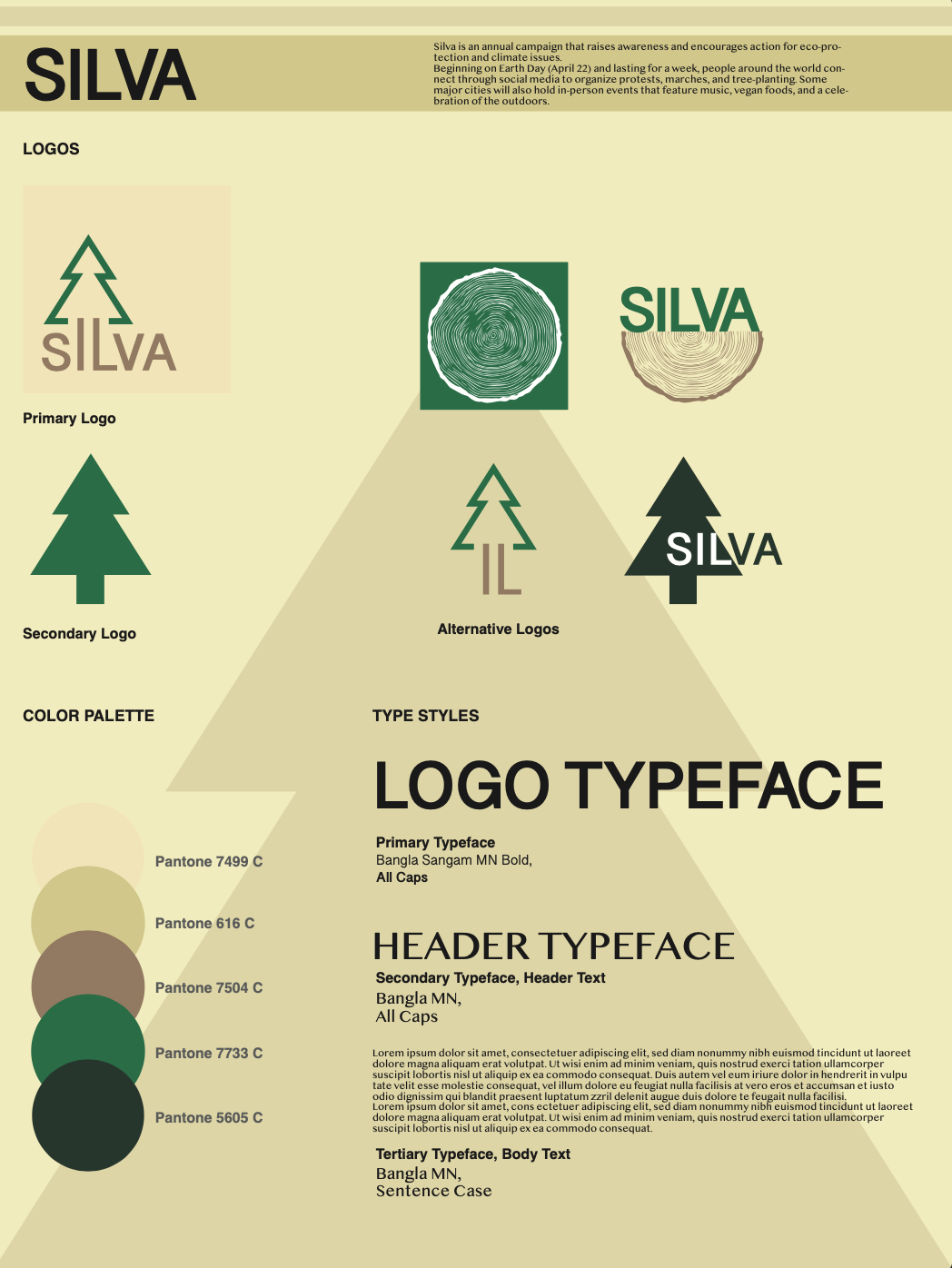
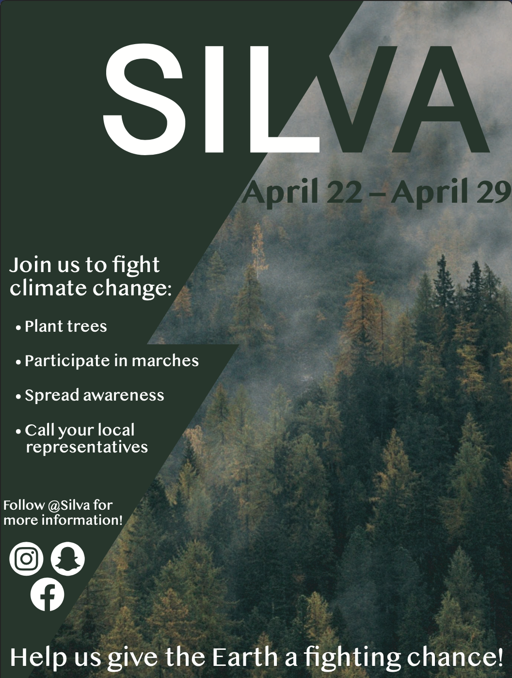
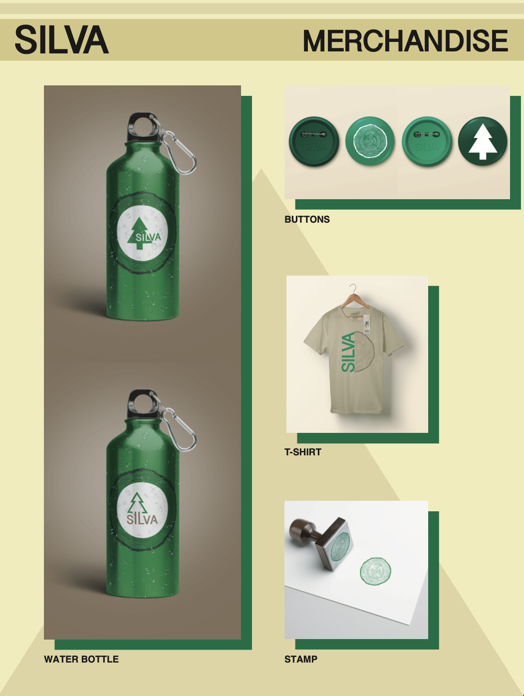
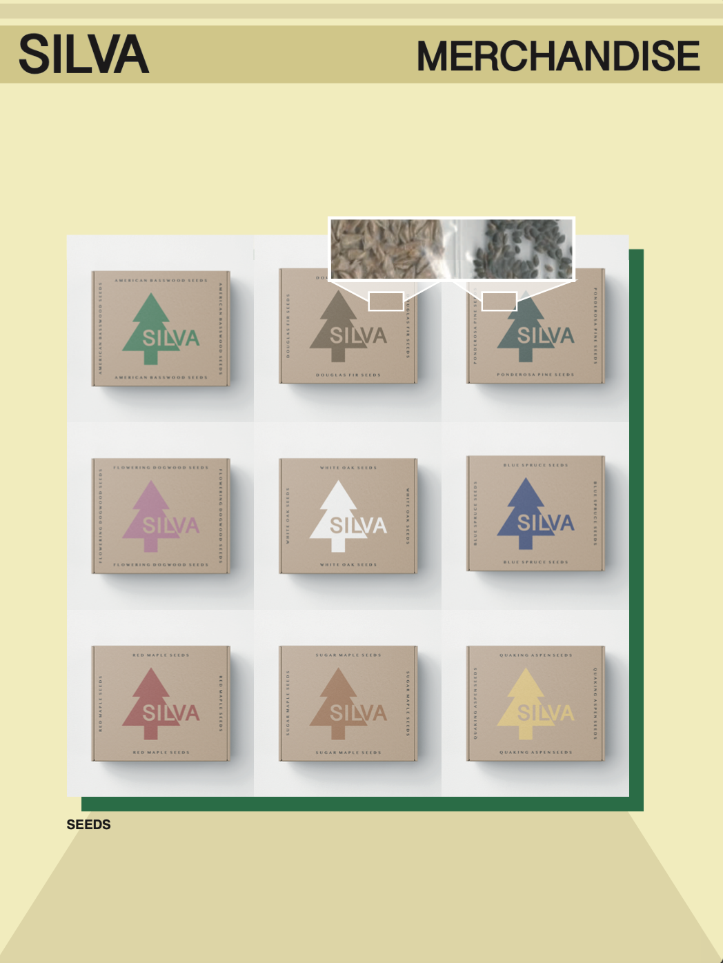
Silva
Silva was an exercise in brand creation that I finished for an early graphic design course at Hampshire College. The project was to create a brand or event from scratch—logos, fonts, color palettes, posters, and merchandise. I chose to build a hypothetical event that focused on taking action against climate change. My first step was to construct a color scheme that had basic earthy tones, but still had a green highlight to make it stand out.
My next step was to establish primary and alternative logos that could work in tandem, but also stand alone. I concluded by designing and creating mockups for different merchandise, including stationery, stamps, business cards, water bottles, pins, t-shirts, posters, and packages of seeds.

other - Invivyd, Firefighters Union Logo, SE Asia Maps, BPMA logo, J Map, Happy Hour posters?